Interactive data visualization dashboard for a WHO risk mapping tool
Project details
Year: 2020
Client: World Health Organization - Headquarters
Objective: Provide WHO users with an interactive dashboard for overall and detailed visualization of the diverse information collected by the WHO Strategic Tool for Assessing Risks.
Deliverables:
- Consolidated database of previously collected data with the WHO Strategic Tool for Assessing Risks.
- Interactive visualization dashboard in English, French and Spanish, with automated aggregation of new data.
- End-user documentation in English, French and Spanish.
Performed activities
The World Health Organization (WHO) has developed a Strategic Tool for Assessing Risks (STAR) . This tool provides a systematic process to support Member States in identifying and quantifying risks, vulnerabilities, and coping capacities.
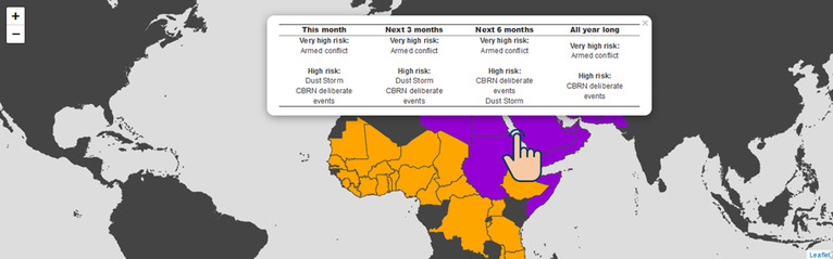
Figure 1. Map of pending hazards
We first analysed, consolidated, and cleaned all previously existing STAR data. We then developed an interactive dashboard using the R statistical software for overall and detailed visualization of the diverse STAR information by level (global, regional and national). The dashboard can be created through an R package on any computer, without the need of any prior knowledge of the R statistical software. Automated aggregation of new STAR information is integrated to remove the time consuming and error-prone exercise of manually adding new results.
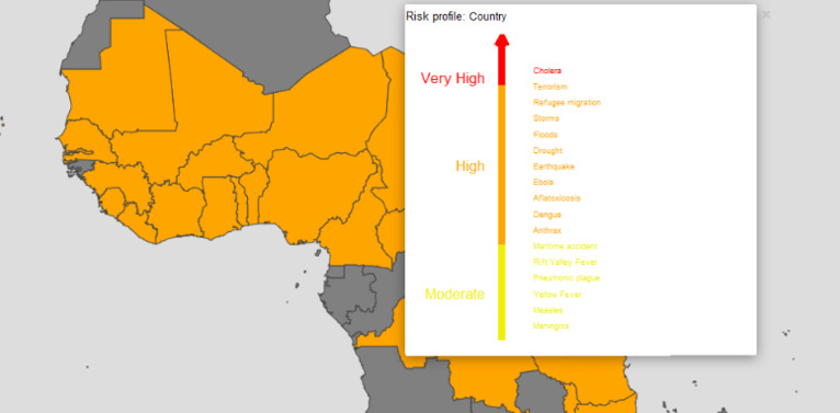
Figure 2. Regional map of country risk profiles
The dashboard can be shared as an HTML file, and is available along with its detailed documentation in English, French, and Spanish.
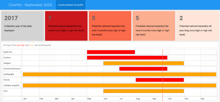
Figure 3. Risks calendar
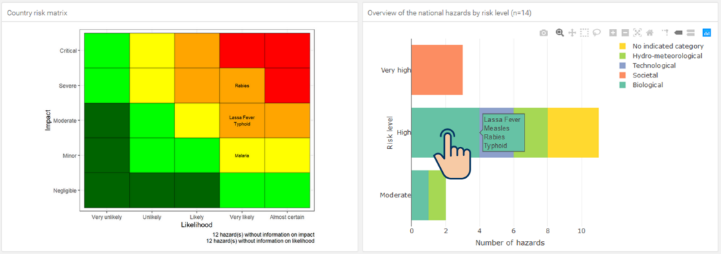
Figure 4. Country risk matrix